Composition
Composition - or what the picture actuallly shows - is largely a matter of taste, or sometimes just what you can actually fit into the shot. If you're trying to reproduce an old photo, the composition will have been chosen for you.
There are some things you can do, however, to try to make your photos more interesting, and some simple rules to follow.
The Rule of Thirds
When people first begin to take photos, their instinctive is to make sure that the subject of the photo is in the middle of the shot. However, photographers tend to agree that pictures work better if things are a third of the way in from the edge, rather than in the middle. So, if you're taking a landscape picture, have the horizon either a third of the way down from the top, or a third of the way up from the bottom.
Another common mistake is to have someone's face right in the middle of the photo with nothing above it. Try positioning the face above the centre-line, and perhaps to one side, looking "into" the photo.
Leading the Eye
Another trick photographers use is to have naturals lines and contours in the photograph going through (or near to) the corners to lead the eye into the middle of a photography.
Scale and Perspective
A large mountain or lake might look very impressive when you're standing in front of it, but when you see the photo, 15cm across, in front of you on the table it will look rather different. Unless they've been there themselves, the person looking at your photo won't know just how large or small the object in the photo is. It's a good idea to include something in the photo that people do know the size of - something like a person, an animal, a phone box, etc.
Have a Subject
Even if the setting is lovely, your photo can be rather disappointing. I disovered this after my first trip to the Lake District. It was back in the days of film - I thought the scenery was fantastic and the photos would be too. Until I got them back from being developed. They were disappointing, partly because I didn't get a sense of the scale (see the paragraph above), but also because they weren't really of anything. They were all background and no subject. For example, you might find that a photo of a friend of family member standing in front of a hill is better than a photo of a hill!
Examples
I'm not claiming to say that these are the best photos in the world, but they're examples of where I've tried to follow the rules above. The beach was particularly difficult to capture - it looked really nice, with palm trees and the waves crashing on the sand, but the first photos I took looked really boring. Then I noticed the driftwood and tried to include it as a focal point in the foreground. Just as I was about to take it, a couple walked past and left the footprints which added more interest.
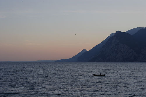 This was a nice view of the lake before the boat appeared, but the boat adds interest and a sense of scale. The boat is also a third of the way across from the right and the water fills the bottom third of the frame.
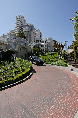
This is Lombard Street in San Francisco - supposedly the world's windiest street.
As the photo was really about how windy the road was, I thought it made sense to try to get the road winding through the photograph (although it would have help to be higher up as the road disappears behind the hedge in the top half of the picture).
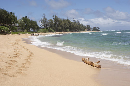 The picture is a third sky and two-thirds sea/sand, and I tried to include something in the foreground for scale and interest. The edge of the surf and the footprints lead into the photo.
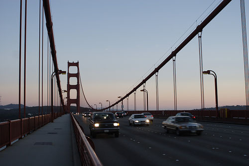 Here, the cables supporting the bridge, the footpath and the lines on the road all lead the eye into the photo. The inclusion of the cars gives you a sense of scale and the slight blurring of some of them also gives them a sense of motion.
 This was a nice view of the lake before the boat appeared, but the boat adds interest and a sense of scale. The boat is also a third of the way across from the right and the water fills the bottom third of the frame.

 The picture is a third sky and two-thirds sea/sand, and I tried to include something in the foreground for scale and interest. The edge of the surf and the footprints lead into the photo.
 Here, the cables supporting the bridge, the footpath and the lines on the road all lead the eye into the photo. The inclusion of the cars gives you a sense of scale and the slight blurring of some of them also gives them a sense of motion.